Heatmap Walkthrough — A Complete Tour of the Interface
The Quickstart showed you a four-step workflow for getting your first observation. This guide is different in purpose: it's a complete tour of the heatmap interface itself. Every toggle, every filter, every panel — what it does, when to use it, and how to read what it shows.
If the Quickstart is "what to do in five minutes," this is "what every part of the screen actually means." Once you've read it, you'll be able to open any asset on any expiry and understand the layout without guessing.
The examples throughout use SPY 0DTE, since US equity options are familiar to most readers and let us walk through features that aren't always visible on crypto.
A note on framing: GEX and VEX describe market structure — where dealer hedging activity is concentrated and what character of price interaction may emerge at each level. They are not buy or sell signals. Treat the interface as a reading tool, not a prediction tool.
1. Asset Selector
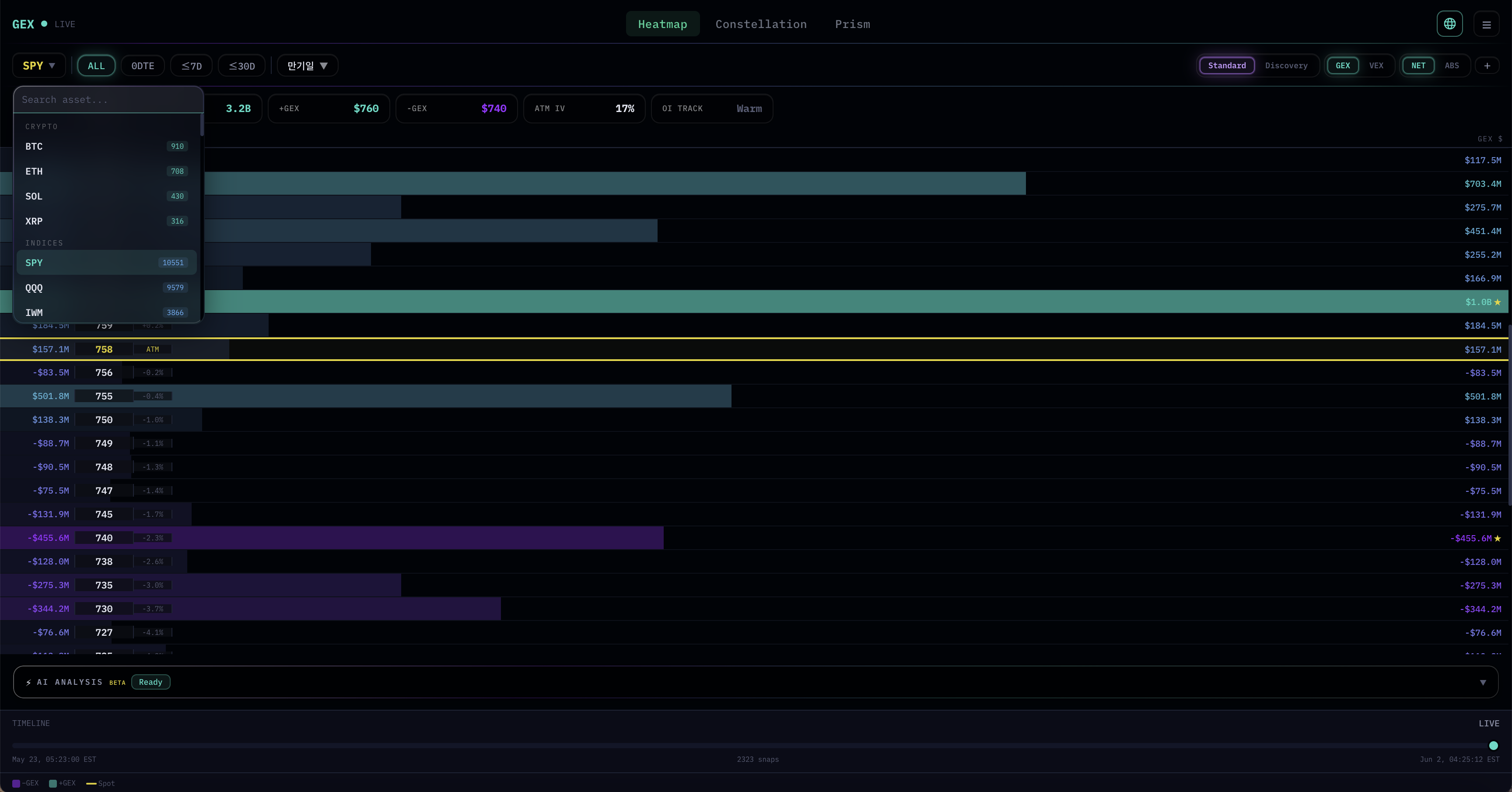
The asset selector is in the top-left corner. Click the asset name (e.g., SPY ▼) to open the dropdown.
Assets are organized into four categories, each color-coded for quick recognition:
- CRYPTO (green badges) — BTC, ETH, SOL, XRP
- INDICES (blue badges) — SPY, QQQ, IWM, and other major index ETFs
- COMMODITIES (orange badges) — GLD, SLV, USO
- STOCKS (purple badges) — Individual equities like AAPL, ADBE, ADI, etc.
The number next to each asset indicates how many option contracts are currently active (with open interest or trading volume greater than zero). It's a quick liquidity signal: assets with higher counts have richer options markets and produce more granular heatmaps. A small number doesn't mean an asset is unusable — it just means fewer strikes will appear and the data is sparser.
A search field at the top of the dropdown lets you type any ticker to jump directly. Useful when you have hundreds of stocks listed and don't want to scroll.
2. Expiry Filter
To the right of the asset selector you'll find a row of expiry filters: ALL · 0DTE · ≤7D · ≤30D · Expiry ▼
Each filter changes which options contracts get aggregated into the heatmap:
- ALL — Every available expiry combined. Gives the widest structural view. Use this for understanding the long-term gamma landscape.
- 0DTE — Only options expiring today. Most relevant for day-trading; nodes can be intense because of the gamma concentration that happens near expiry.
- ≤7D — All expiries within the next seven days. A good middle ground for swing observation.
- ≤30D — Roughly the monthly OPEX window. Useful for monthly positioning reads.
- Expiry ▼ — Opens a dropdown listing every individual expiry available. Pick one specific date to isolate that expiry's gamma profile.
Different filters can surface very different structures. A strike that looks like an anchor on 0DTE may be small on ALL, and vice versa. Always be aware of which filter is active.
3. View Modes
The right side of the top bar holds the view-mode toggles. Five groups, left to right.
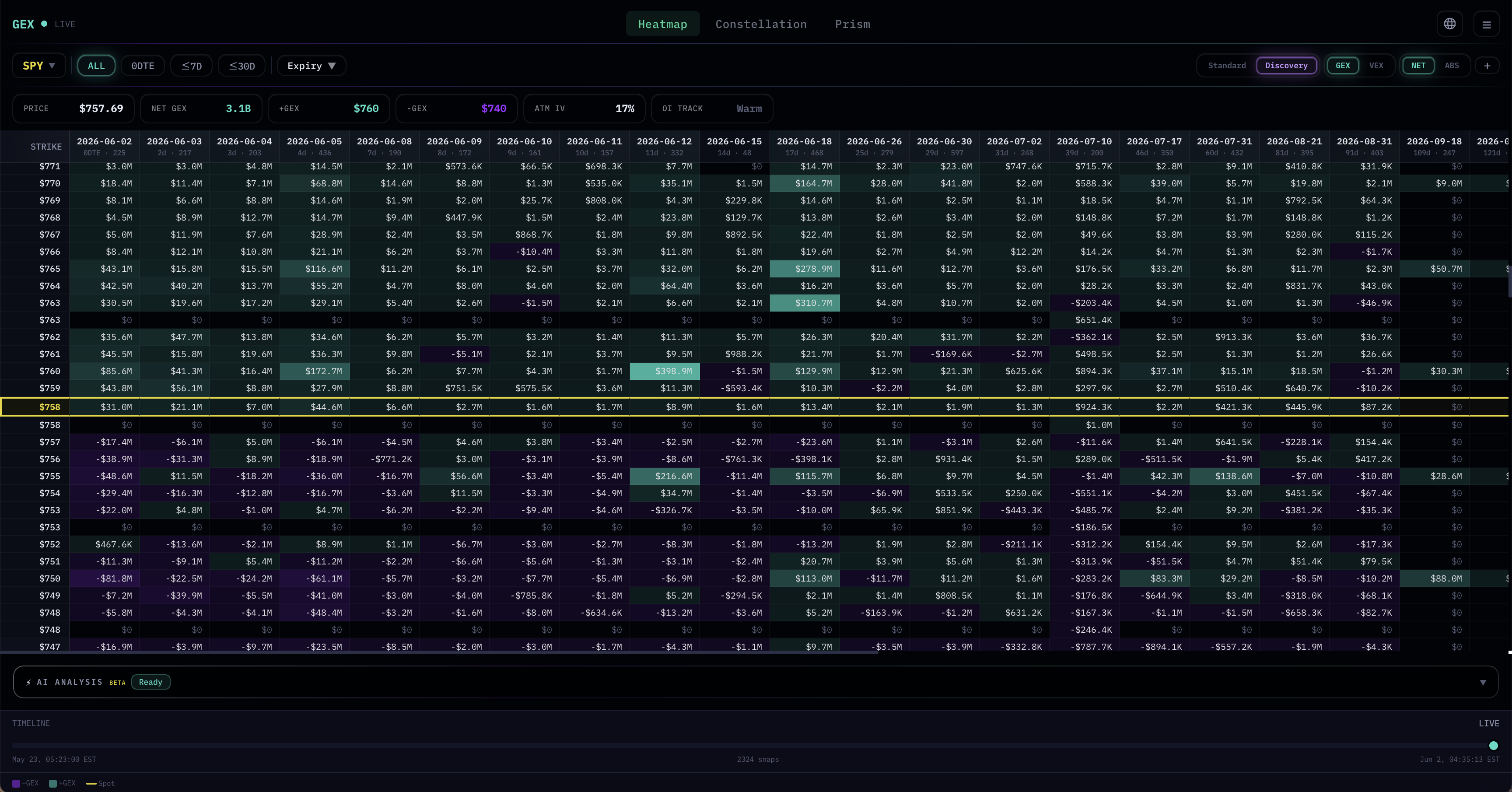
Standard vs. Discovery
- Standard — A single column of strikes with horizontal bars. This is the default view, and it's what the Quickstart walked through. Best for reading the current expiry filter as a single landscape.
- Discovery — A Strike × Expiry matrix. Each row is a strike; each column is a specific expiry date. Cell color shows the GEX (or VEX) value at that strike for that expiry. This view is swing-friendly: it lets you see how gamma exposure is distributed across the upcoming weeks at a glance, which strikes are loaded across multiple expiries, and where structure is concentrated in time. Clicking a cell currently does nothing — it's a reading view, not an interactive drill-down.
GEX vs. VEX
Switches what the heatmap measures: gamma exposure or vanna exposure. The strike layout stays the same; only the values change. The Quickstart covers reading both in workflow context; the Concepts chapters cover the theory.
NET vs. ABS
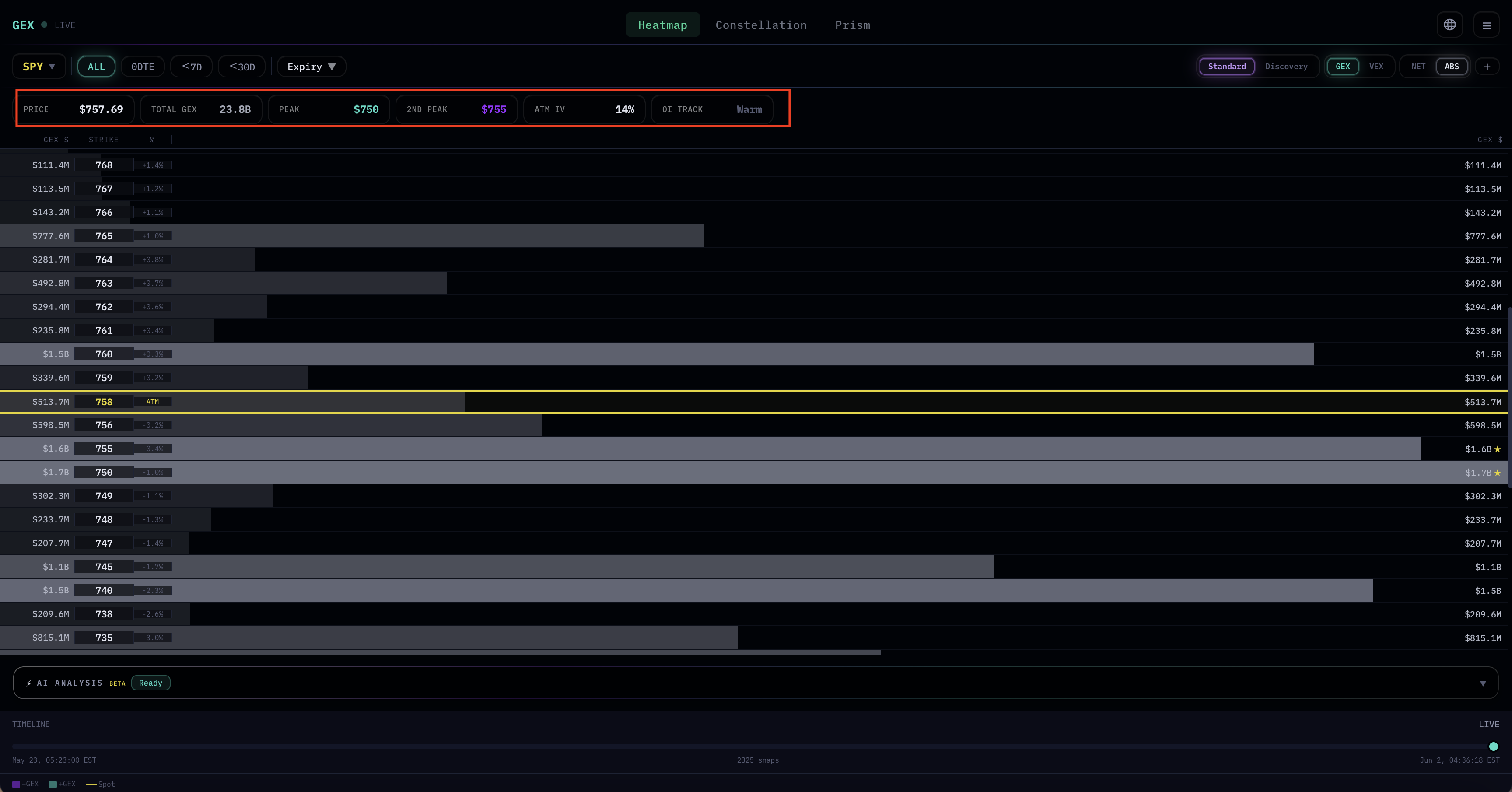
This toggle has a subtle but important consequence: the header labels change.
- NET mode shows signed values. The header displays: PRICE / NET GEX / +GEX Strike / −GEX Strike / ATM IV / OI Track. The heatmap bars extend right for positive nodes (green) and left for negative nodes (purple).
- ABS mode shows absolute values only — signs are stripped. The header switches to: PRICE / TOTAL GEX / Peak / 2nd Peak / ATM IV / OI Track. Every bar extends in the same direction, and the focus shifts to which strikes are heaviest in magnitude, regardless of whether they're positive or negative.
When to use which: NET when you care about the sign battle (does +GEX dominate or does −GEX?); ABS when you just want to find the heaviest strikes fast and don't want sign to bias the visual.
The + Button — Multi-Panel View
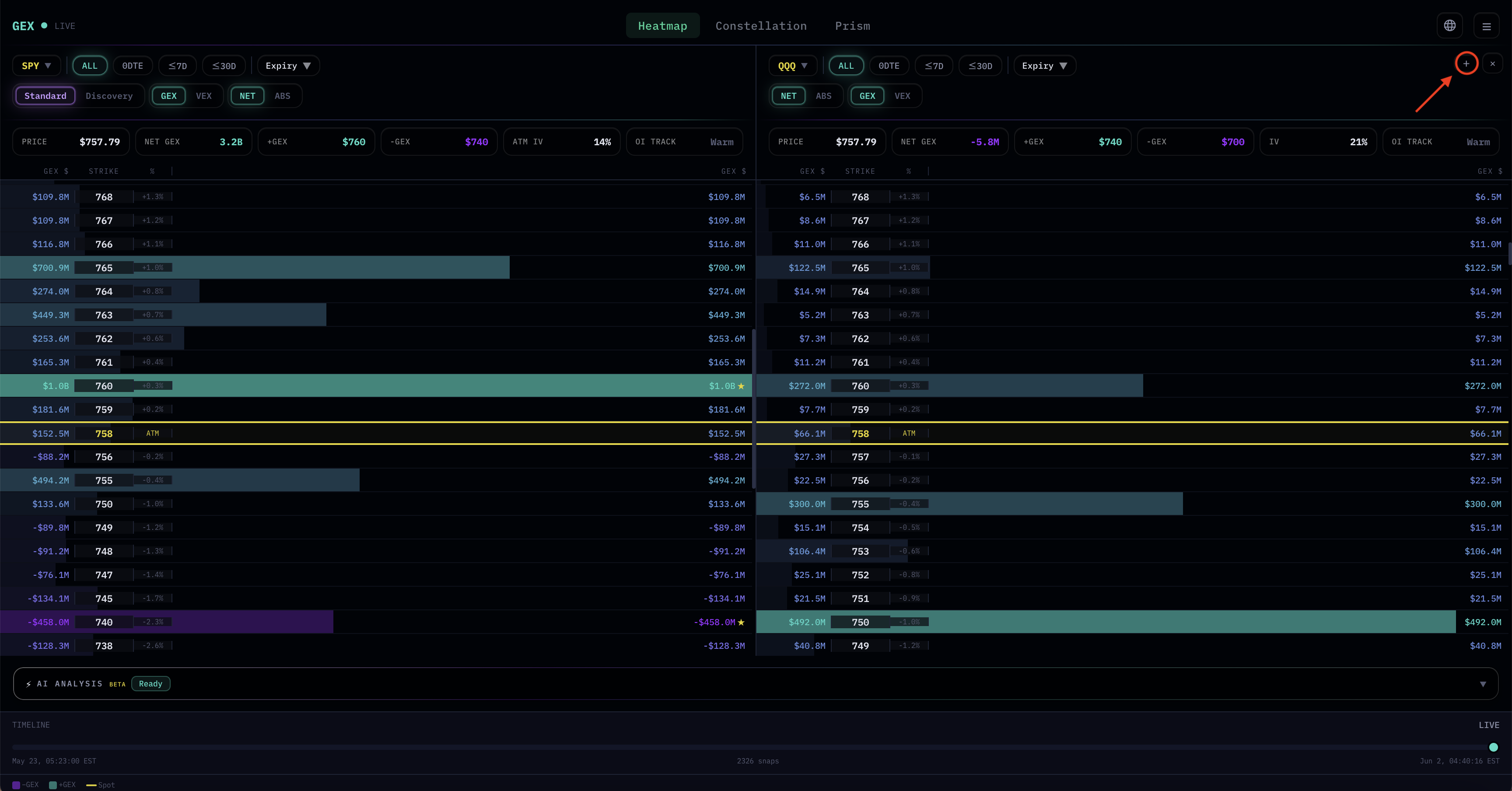
The plus button at the far right of the controls bar opens additional panels alongside the current view, up to three panels total. Each panel is fully independent: its own asset, its own expiry filter, its own NET/ABS toggle, its own GEX/VEX toggle. Close any added panel with its × button.
This is one of the most powerful features for serious reading, because it lets you put related views side by side instead of toggling and losing context. A few common setups:
- Multi-asset confluence — SPX, SPY, and QQQ side by side. When all three show heavy structure at the same percentage offset from spot, that agreement carries more weight than any single asset's reading on its own. This connects directly to the Multi-Asset GEX Confluence concept covered in the Concepts section.
- Same asset, multiple expiries — Panel 1 at 0DTE, panel 2 at ≤7D, panel 3 at ≤30D. Lets you watch how short-term, swing, and structural gamma all line up at the same strikes (or diverge).
- GEX and VEX side by side — Same asset, same expiry, but one panel set to GEX and one to VEX. Confluence between the two becomes immediately visible without toggling.
- Sister assets — BTC and ETH together, or SPY and IWM, to read correlated markets in parallel.
The Timeline at the bottom is shared across all panels — scrubbing back into REPLAY moves every panel together, which is useful for studying how a coordinated move set up across multiple assets.
Multi-panel is also where the value of identifying high-activity assets (the badge numbers from the asset selector) pays off: comparing three sparse assets gives less signal than comparing three dense ones.
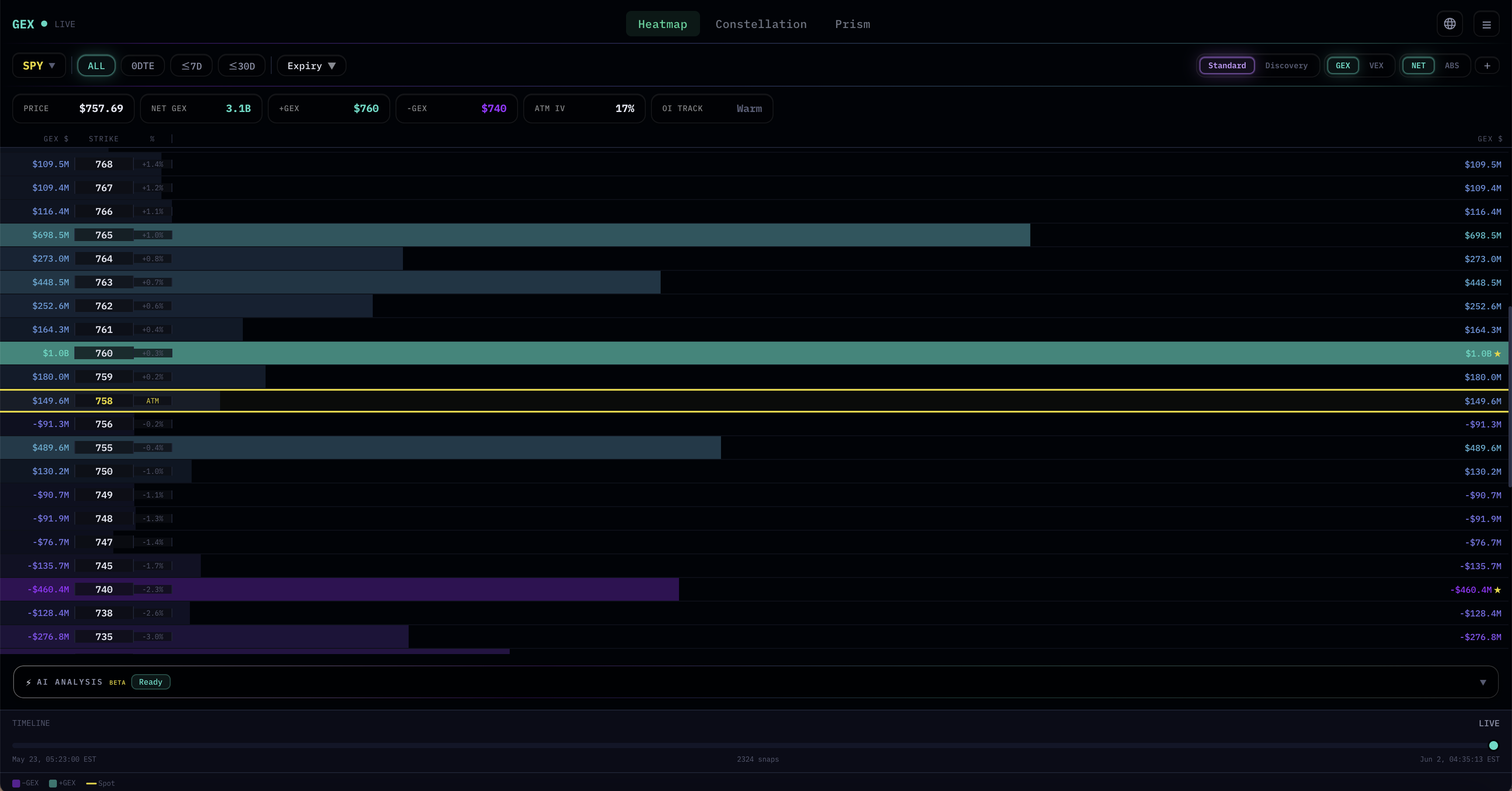
4. Header Panel
The strip directly below the controls is the header panel. It summarizes the current view in six fields.
In NET Mode
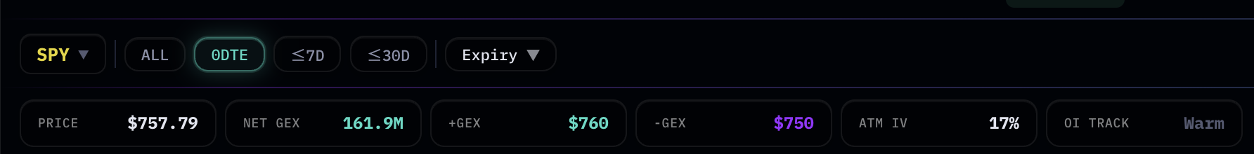
- PRICE — Current spot price of the underlying. For US equity ETFs and stocks this updates during regular trading hours; for crypto it updates 24/7.
- NET GEX — The signed sum of all gamma exposure in the current expiry filter. Positive numbers mean the inferred market gamma leans positive; negative leans negative. Treat this as background atmosphere, not as a signal.
- +GEX Strike — The single strike with the largest positive GEX node. Marked with a ★ in the heatmap.
- −GEX Strike — The single strike with the largest negative GEX node. Also marked with a ★.
- ATM IV — The implied volatility at the strike nearest the current spot price. A useful single-number sense of how expensive options are today.
- OI Track — A data-quality indicator showing whether open-interest history is fully accumulated for the current asset and filter. Active (green) means history is ready and being tracked; Warm (gray) means data is still building up (common in pre-market or just after a new asset is added). It's not a trading signal — it tells you how reliable the historical context behind the current snapshot is.
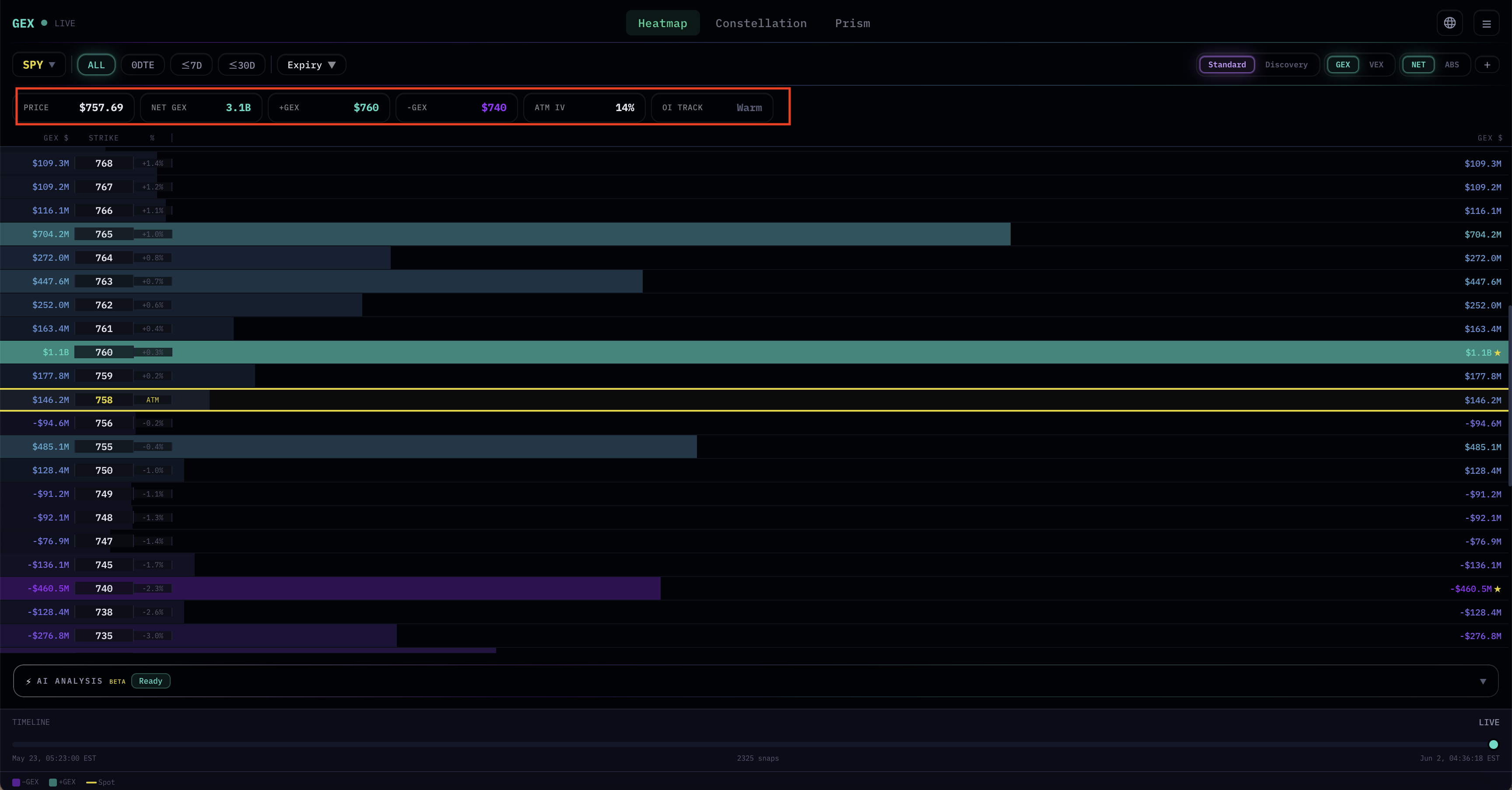
In ABS Mode
When you switch to ABS, three of the fields change:
- TOTAL GEX replaces NET GEX — it's the sum of absolute values, so always positive.
- Peak replaces +GEX Strike — it's the strike with the highest absolute GEX, regardless of sign.
- 2nd Peak replaces −GEX Strike — the second-largest absolute node.
This is genuinely useful when you don't want sign to bias your eye. The Quickstart's Step 1 ("find the max absolute node") maps directly onto Peak.
5. The Heatmap Itself
The main body of the screen is the heatmap. Each row corresponds to a single strike, ordered by price (highest at top, lowest at bottom).
Layout
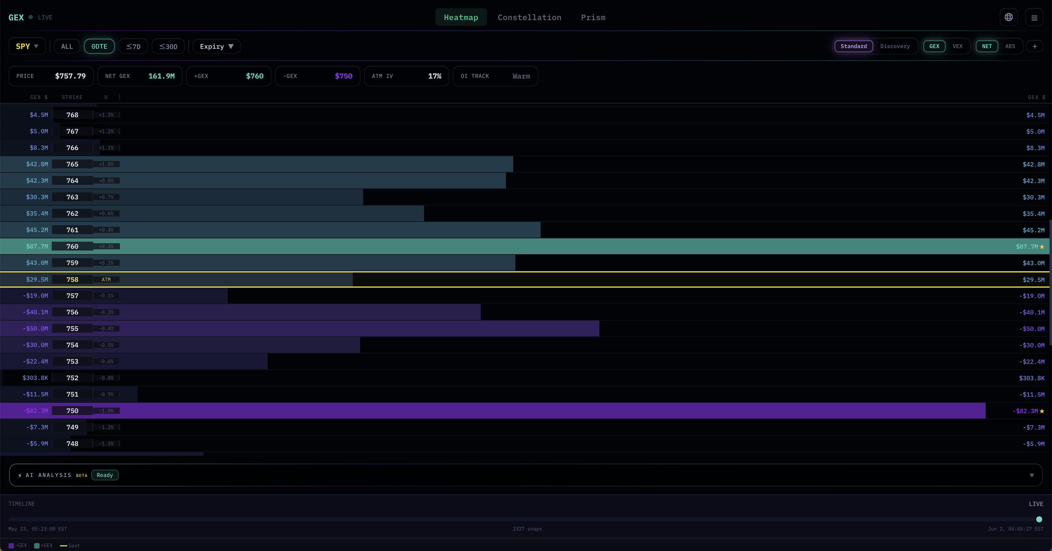
Each row has the same structure:
- Left side: GEX (or VEX) dollar value, followed by the strike and the percentage distance from current spot
- Center: Two mirrored horizontal bars that extend outward — the bar length encodes the magnitude of the node relative to the heaviest node visible
- Right side: Same dollar value, mirrored for symmetric readability
The mirroring is visual, not functional. Each strike is one node; it just gets displayed twice for layout balance and easier reading at scale.
Color Coding
- Green bars — Positive GEX (or VEX) at that strike
- Purple bars — Negative GEX (or VEX)
- Yellow line / ATM row — The strike closest to current spot price. This is your visual anchor for "where price actually is right now."
The opacity of each bar scales with magnitude relative to the heaviest visible node. A long, bright bar is a major level; a faint short bar is noise. This makes the heaviest strikes pop visually without you needing to read every number.
The ★ Anchors
Two strikes per view receive a ★ marker (in NET mode): the largest positive node and the largest negative node. These are the strikes the header is also reporting in +GEX Strike and −GEX Strike. The marker is just a visual shortcut — you don't need to scroll and compare numbers to find them.
In ABS mode the ★ behaves similarly, but for the largest absolute nodes (Peak and 2nd Peak).
Reading Asymmetry
One thing worth attention: the magnitudes above and below the current price are often asymmetric. If the positive side has nodes summing to $5B and the negative side has nodes summing to $1B, that asymmetry itself is information about how the gamma landscape is loaded. It's not a directional signal, but it tells you which side of the current price has more "structural weight."
The Concepts chapter on Reading the Heatmap goes deeper into asymmetry interpretation.
6. Bottom Controls
Below the heatmap body are two more sections: AI Analysis (covered next) and the Timeline.
Timeline Slider
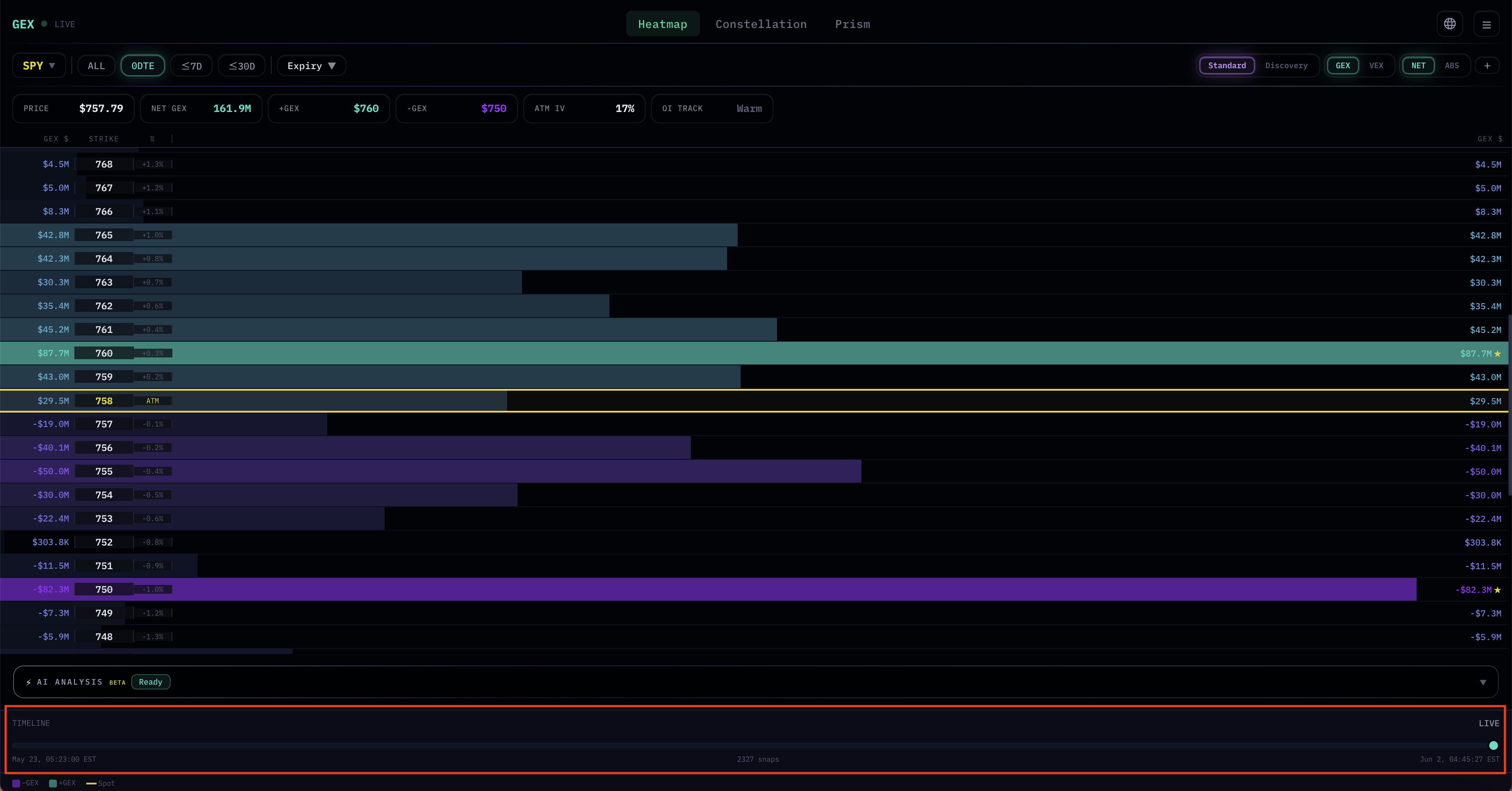
The Timeline at the bottom of the page lets you scrub backward through historical snapshots:
- Left label — The earliest snapshot in storage (typically a few days back; depends on the asset)
- Right label — The current snapshot, marked LIVE
- Center text — Total number of snapshots in the current view (e.g.,
2,187 snaps) - Dot — Your current position on the timeline. Drag it left to enter REPLAY mode.
When you drag the dot away from the LIVE position, the header changes: a yellow REPLAY badge appears next to the asset name, and the right label shows the exact timestamp of the snapshot you're viewing. To return to live data, drag the dot back to the right end or click LIVE.
Replay is useful for studying how structure evolved into a known move — for example, scrubbing back to see what the heatmap looked like just before yesterday's open. Note: this is purely for studying past structure, not a backtesting feature.
When multiple panels are open, the Timeline is shared — scrubbing back moves every panel to the same historical timestamp simultaneously. This is especially useful for studying coordinated moves across related assets.
Legend
At the very bottom, three small swatches: −GEX (purple) · +GEX (green) · Spot (yellow). These match the heatmap's color coding.
7. AI Analysis Panel
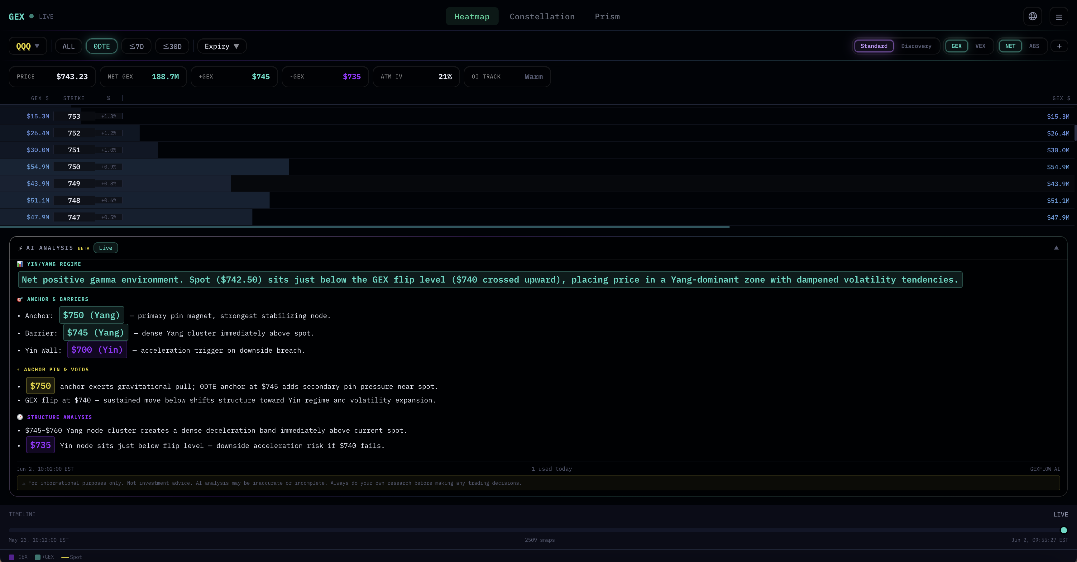
Between the main heatmap and the Timeline sits a collapsible bar labeled AI ANALYSIS · BETA · Ready.
Click the bar to expand. It produces a short natural-language reading of the current view: which strikes are dominant, whether NET GEX is positive or negative, what kind of environment the structure suggests, and how to interpret major asymmetries. The output is generated fresh from the live snapshot you're looking at, so changing assets or filters and re-expanding the panel gives a new reading.
This is useful when you want a quick sanity check on your own reading, or when you're scanning many assets and want to triage which ones are worth deeper attention. The AI is doing the same observation you would do — finding the major nodes, noting sign, comparing magnitudes — and stating it in plain text.
AI Analysis is only available when that asset's market is open. For US equities, indices, and commodities, that means regular trading hours. For crypto, which trades 24/7, it's available continuously. When the market is closed, the panel will indicate so rather than producing analysis on stale conditions.
The output is observation, not prediction. It deliberately avoids directional calls.
8. Putting It Together
Now that the interface is mapped, here's a more advanced workflow that uses features the Quickstart didn't touch:
- Pick an asset with healthy contract activity (high badge number) for a richer heatmap.
- Start in Discovery mode to see the gamma landscape across all upcoming expiries — identify which strikes carry weight across multiple expiries (strong horizontal stripes in the matrix).
- Switch to Standard mode and pick the most relevant expiry filter for your timeframe (0DTE for day-trading, ≤7D for swing, ALL for structural).
- Toggle ABS to find the heaviest strikes without sign bias. Note the Peak and 2nd Peak from the header.
- Toggle back to NET to read sign — which heavy strikes are positive, which are negative.
- Cross-check with VEX by switching the GEX/VEX toggle. Are the heaviest GEX strikes also heavy in VEX? That confluence matters.
- Open additional panels for related assets — for US equity reads, putting SPX, SPY, and QQQ side by side reveals whether the structure you're seeing is asset-specific or part of a broader index-wide pattern.
- Optionally, expand the AI Analysis panel for a second-opinion reading.
- Mark the major strikes on your price chart and watch how price interacts with them.
This is a more thorough version of the Quickstart workflow. Same principle — find the heavy strikes, mark them, watch — but using more of what the interface offers, including multi-panel comparisons that single-panel reading can't surface.
What to Read Next
- Constellation Walkthrough → — Instead of reading a single snapshot, see how GEX evolves over time on a price chart. Useful for spotting accumulation, dissipation, and reshuffle patterns.
- Concepts: Understanding GEX → — The theoretical foundation of what gamma exposure is and why it behaves the way it does.
- Concepts: Reading the Heatmap → — A deeper, theory-focused treatment of asymmetry, anchor strikes, and the 5-step framework.
- Concepts: GEX/VEX Confluence → — Including the Multi-Asset GEX Confluence concept that multi-panel views make easy to spot.
- Quickstart → — If you skipped it, the 4-step workflow that gets you to your first observation in 5 minutes.
A Final Note
The interface is a reading tool, not a decision tool. Every toggle and filter exists to help you ask better questions — "where is the structure heaviest?" "how does it look across expiries?" "do related assets agree?" — but the answers always need to be checked against actual price action.
A well-built map doesn't tell you where to go. It tells you where the terrain matters.